UI/UX & Product Design

User-Obsessed UI/UX Engineered for High Conversion.

We design prestigious digital products, SaaS dashboards, and mobile application interfaces that delight users and eliminate friction. From wireframes to scalable Figma design systems — engineered for high engagement and retention.

Figma Auto-Layout & Tokens
Data-Driven UX & User Journeys
100% Developer-Ready Handoff
Markino Digital Bespoke UI/UX Design and Prototyping Systems
4.2x User Engagement
-68% Onboarding Drop-off
100% Figma Tokens Ready
THE MARKINO DIFFERENCE

The Typical Agency vs. Markino Product Design

We don't just draw pretty screens. We engineer data-backed user journeys, interactive Figma prototypes, and modular design systems that developers can build with zero ambiguity.

TYPICAL DESIGN AGENCY

Surface-Level Artwork

  • ×
    Superficial visual designs: Pretty screenshots built without user research, heuristic analysis, or conversion optimization.
  • ×
    Messy unstructured Figma files: Random layers, no auto-layout, unlinked components, and zero design token structure.
  • ×
    Developer friction & guesswork: Developers waste dozens of hours trying to guess paddings, responsive breakpoints, and hover states.
  • ×
    Static non-clickable mockups: Clients only see flat PNGs with zero interactive feel or user testing validation.
  • ×
    Accessibility ignored: Low-contrast typography, unreadable font sizes, and complete failure of WCAG standards.
  • ×
    Vendor lock-in & fragmented files: Refusal to hand over editable Figma libraries or component design systems.
MARKINO PRODUCT STANDARD

High-Converting Digital Experience

  • ✓
    Data-driven user journeys: User persona mapping, wireframing, competitor benchmarking, and conversion-first UX psychology.
  • ✓
    Modular Figma Design Systems: 100% Auto-Layout 5.0, variables, design tokens, typography scales, and responsive variants.
  • ✓
    Seamless developer handoff: Exact CSS/Tailwind specifications, exported SVG assets, redlines, and interactive states ready for code.
  • ✓
    Clickable interactive prototypes: Realistic user testing prototypes in Figma/Framer with micro-interactions and transitions.
  • ✓
    WCAG 2.2 AA Accessibility: Certified color contrast ratios, screen-reader hierarchy, and touch-target ergonomics.
  • ✓
    100% Full asset & Figma ownership: Direct transfer of master Figma files, UI kits, design token JSONs, and commercial rights.
OUR UI/UX CAPABILITIES

End-to-End Product Design & UX Engineering

From early-stage wireframe validation to production-ready design systems, we design intuitive interfaces that turn complex products into effortless user journeys.
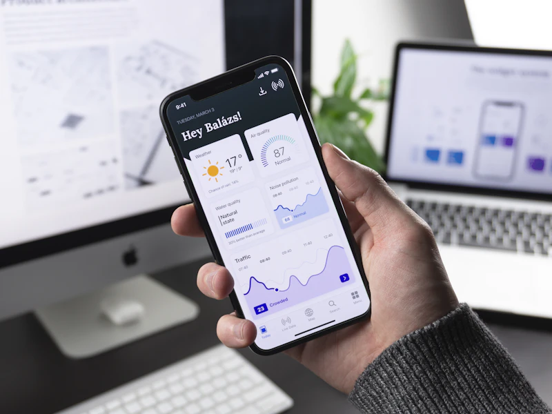
Mobile App UI/UX Design for iOS and Android by Markino Digital

Mobile App UI/UX (iOS & Android)

Native iOS Human Interface & Google Material You app designs engineered for single-thumb ergonomics, tactile micro-gestures, and sub-second user task completion.

  • Native iOS & Android Design Systems
  • Touch-Ergonomic Component Architecture
  • Interactive Micro-Interactions & Haptics
Connect With Us
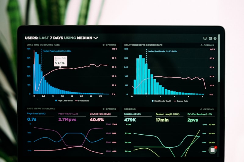
SaaS and Enterprise Web Application UI/UX Design by Markino Digital

SaaS & Web App Dashboards

Data-dense analytics platforms, multi-tenant B2B portals, and complex cloud software dashboards simplified into intuitive, high-velocity workspaces.

  • Complex Data Visualization & Charts
  • Multi-Role Permission & Table UX
  • Onboarding Wizard & Activation Flows
Connect With Us
High-Converting Commercial Landing Page UX Design by Markino Digital

Conversion-Focused Landing Pages

Direct-response page structures engineered with visual hierarchy, cognitive persuasion architecture, and frictionless CTA funnels that maximize ad ROAS.

  • Cognitive Eye-Tracking & Visual Flow
  • High-Impact Social Proof Placements
  • Frictionless Form & Lead-Gen UX
Connect With Us
Figma Design Systems and Component Token Architecture by Markino Digital

Design Systems & Token Architecture

Single source-of-truth UI libraries built with Figma Variables, dark/light mode modes, typography scales, and token sync for seamless dev engineering.

  • 100% Figma Auto-Layout 5.0 Components
  • Design Tokens Sync (W3C Standard)
  • Light / Dark Mode Theming Support
Connect With Us
Interactive Clickable Prototyping and Wireframes by Markino Digital

Interactive Clickable Prototyping

High-fidelity interactive prototypes in Figma, Framer, and ProtoPie that mimic real software feel for investor pitches, stakeholder sign-offs, and user testing.

  • High-Fidelity Smart Animate Transitions
  • Real Dynamic Input Field Validation
  • Shareable Stakeholder & Investor Links

Connect With Us
UX Heuristic Audit and Conversion Rate Optimization by Markino Digital

UX Audit & Conversion Optimization

Deep-dive heuristic evaluations, funnel drop-off diagnostics, heatmap behavioral analysis, and actionable UI redesign roadmaps that systematically unlock revenue.

  • Nielsen Norman Heuristic Evaluation
  • Heatmap & Scroll Drop-Off Diagnostics
  • Prioritized High-ROI Redesign Backlog

Connect With Us
ENGINEERING RIGOR

The 6 Pillars of Our UI/UX Standard

Every interface we design is underpinned by scientific behavioral psychology, strict accessibility compliance, and developer-first documentation.

01

User Journey & Mental Models

We map real human decision trees, cognitive load thresholds, and frictionless task pathways before designing a single pixel.

02

Atomic Design & Variables

Components constructed with Figma Variables, nested Auto-Layout, and tokenized spacing, colors, and typography primitives.

03

WCAG 2.2 AA Accessibility

Every screen satisfies global contrast standards (4.5:1+), keyboard focus rings, readable hierarchy, and touch-target minimums (48×48px).

04

Behavioral CRO & Persuasion

We leverage Hick’s Law, Fitts’s Law, visual chunking, and strategic micro-copy to guide users smoothly toward conversion actions.

05

Fluid 8pt Responsive Grids

Pixel-perfect layouts mapped to a strict 8pt grid with responsive fluid scaling for mobile (375px), tablet (768px), and 4K desktop displays.

06

Developer Handoff with Zero Guesswork

Complete component states (default, hover, active, focused, disabled), exported SVG assets, redlines, and CSS/Tailwind specifications.

CORE TOOLS & DESIGN ENGINES

Tools & Frameworks We Specialize In

We utilize industry-standard design, testing, and tokenization tools to guarantee world-class UI consistency, interactive prototyping, and seamless developer handoff.

Figma & Design Systems

Enterprise-grade Figma setups utilizing nested Auto-Layout, component variants, Figma Variables, and light/dark theme modes.

Figma Auto-Layout 5.0 Figma Variables Design Token Architecture Component Variants Dark / Light Theming UI Kit Governance

Prototyping & Micro-Interactions

Realistic interactive flows, tactile micro-gestures, spring physics, and animated transitions that demonstrate true software behavior.

Framer Motion ProtoPie High-Fidelity Figma Smart Animate Lottie JSON Animations Spring Physics Interactive Form Logic

User Research & Testing

Unmoderated usability testing, tree-testing, clickstream analysis, and heatmap validation to verify every design decision with real data.

Maze Usability Testing Hotjar Heatmaps UserTesting.com Optimal Workshop A/B Testing Framework Google Analytics 4

Developer Handoff & Tokens

Production-ready design tokens synchronized directly with engineering repositories for zero translation loss in Next.js or React.

Storybook Components Tokens Studio for Figma Tailwind CSS Preset GitHub Token Sync Zeplin Specs Clean SVG Export
OUR 5-STAGE PROCESS

How We Design High-Converting Product Interfaces

A structured, human-centered 5-stage design methodology transforming complex product workflows into intuitive, joyful user experiences.

PHASE 01

Understand

We interview stakeholders, map user personas, audit competitor friction points, and define core conversion KPIs.

PHASE 02

Plan

We architect information hierarchies, user task flows, and low-fidelity wireframes to validate usability early.

PHASE 03

Create

We craft high-fidelity Figma UI designs, build scalable design tokens, and build interactive clickable prototypes.

PHASE 04

Launch

We run usability testing, generate developer redline specs, and conduct engineering walkthroughs for seamless buildout.

PHASE 05

Improve

We analyze live user heatmaps, run conversion A/B experiments, and iterate component variants as your product scales.

SELECTED WORK

Digital Products That
& Drive User Retention.

A showcase of bespoke SaaS platforms, consumer mobile apps, and enterprise design systems engineered for effortless user journeys, high adoption, and commercial growth.

VIEW ALL WORK
PulseFintech Neo-Bank Mobile App UI/UX Design by Markino Digital
FINTECH MOBILE APP 01

PulseFintech Neo-Bank & Trading

iOS Human Interface • +4.8★ App Store • -54% onboarding drop-off

MedixFlow Clinical SaaS EHR Dashboard UI/UX Design by Markino Digital
HEALTHCARE SAAS 02

MedixFlow Clinical EHR Dashboard

HIPAA WCAG 2.2 Compliant • 3.2x faster chart lookup • Zero dev debt

LuxeAura High-Fashion E-Commerce Mobile UX Design by Markino Digital
LUXURY E-COMMERCE UX 03

LuxeAura Mobile Fashion Store

1-Click Drawer Checkout • +36% AOV uplift • AR try-on flow

NexusCloud DevOps Infrastructure Telemetry UI/UX by Markino Digital
ENTERPRISE SAAS 04

NexusCloud Server Monitoring Hub

High-density telemetry • Dark mode UI • Sub-second alert triage

HyperScale B2B CRM Pipeline Management Interface by Markino Digital
B2B CRM PLATFORM 05

HyperScale Sales Deal Pipeline

Kanban drag-and-drop • +280% rep productivity • Complete design system

AeroFleet Dispatcher Map and Telemetry UX by Markino Digital
LOGISTICS & TELEMETRY 06

AeroFleet Global Fleet Dispatcher

Interactive Mapbox UX • Real-time GPS routing • Touch tablet optimized

OUR QUALITY COMMITMENTS

Guaranteed Design Standards & Developer SLAs

We hold our design engineering to rigorous mathematical, accessibility, and documentation standards. We sign contractual SLAs on deliverable quality.

100% CERTIFIED

WCAG 2.2 AA Accessibility

Every color palette, typographic scale, and interactive element satisfies strict contrast ratios (≥4.5:1) and touch ergonomics.

FIGMA 5.0 STANDARD

100% Auto-Layout & Variables

Zero rogue layers or manual coordinates. All frames resize responsively with clean component variants and semantic token names.

ZERO GUESSWORK

Developer-Ready Specs

Includes all interactive states (hover, active, focus, disabled, loading, empty), exported SVGs, and direct Tailwind CSS token mappings.

POST-HANDOFF SUPPORT

30-Day Engineering Warranty

We remain on standby for 30 days after handoff to assist your developers, clarify edge cases, and refine UI variants as code progresses.

CLEAR ANSWERS

Frequently Asked Questions

Everything you need to know about our UI/UX design process, Figma deliverables, prototyping, and developer handoff.

You receive 100% editable master Figma design files, complete design system components (Auto-Layout 5.0, variables, tokens), clickable interactive prototypes, exported SVG/PNG asset packages, and complete developer handoff documentation with redlines.

We design primarily in Figma using modern features like Figma Variables, Nested Auto-Layout, and Tokens Studio. For advanced interactive animations and usability testing, we utilize Framer, ProtoPie, and Maze.

We design with code in mind. Every component includes all interactive states (hover, active, focus, disabled, error, loading), 8pt grid token spacing, and direct CSS/Tailwind specifications to eliminate developer guesswork.

Yes. We build clickable prototypes and conduct usability testing through Maze and recorded user sessions to identify friction points, confusion, and drop-offs before any engineering begins.

You own 100% of the completed Figma files, UI kits, design tokens, illustrations, and assets upon project completion. We transfer full administrative ownership with zero recurring agency fees.